It was important to examine why logbooks were not being logged correctly. I had assumptions but needed to talk to young drivers who were in the process or had recently obtained their learners permit. I spoke to several about their experience.
I discovered:
From this, I concluded that the target market “just wanted to drive!”
This became the focus for the project.

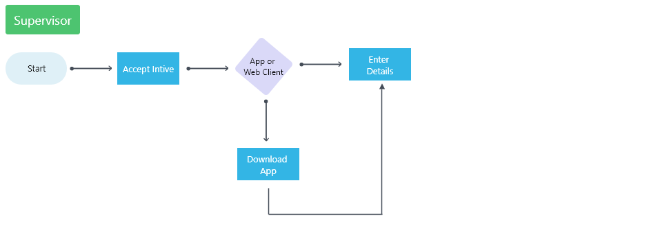
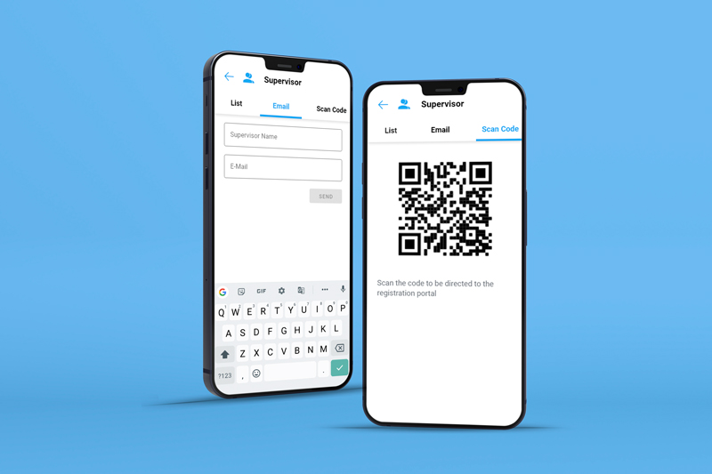
User flow demonstrating the process of adding a new supervisor
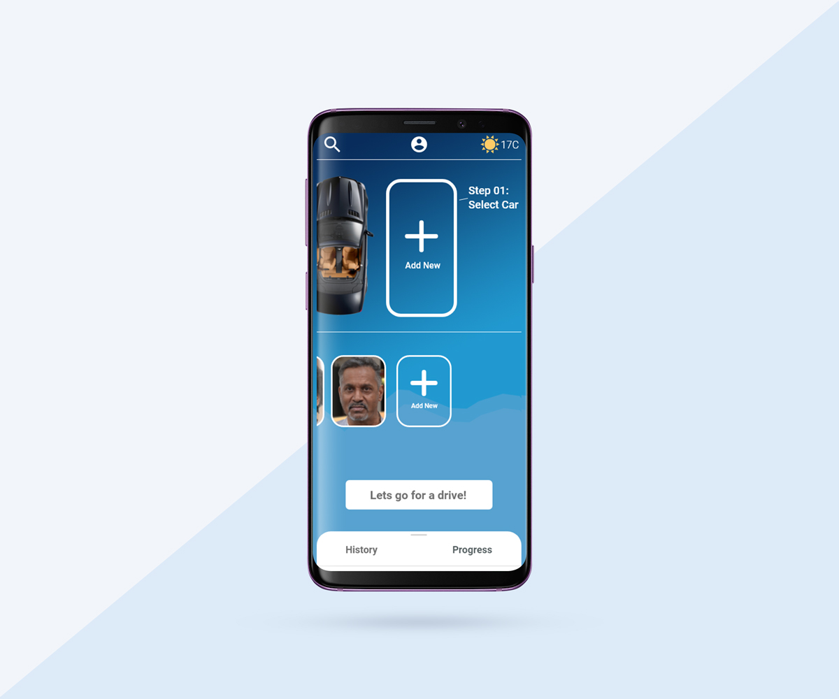
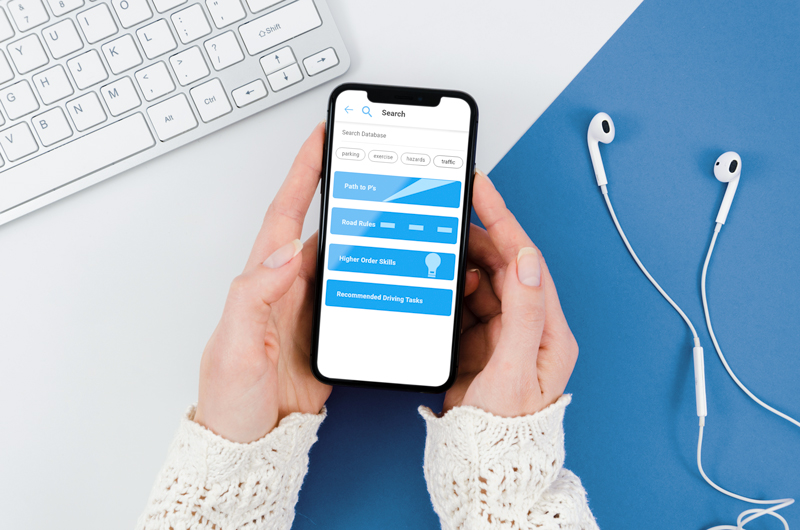
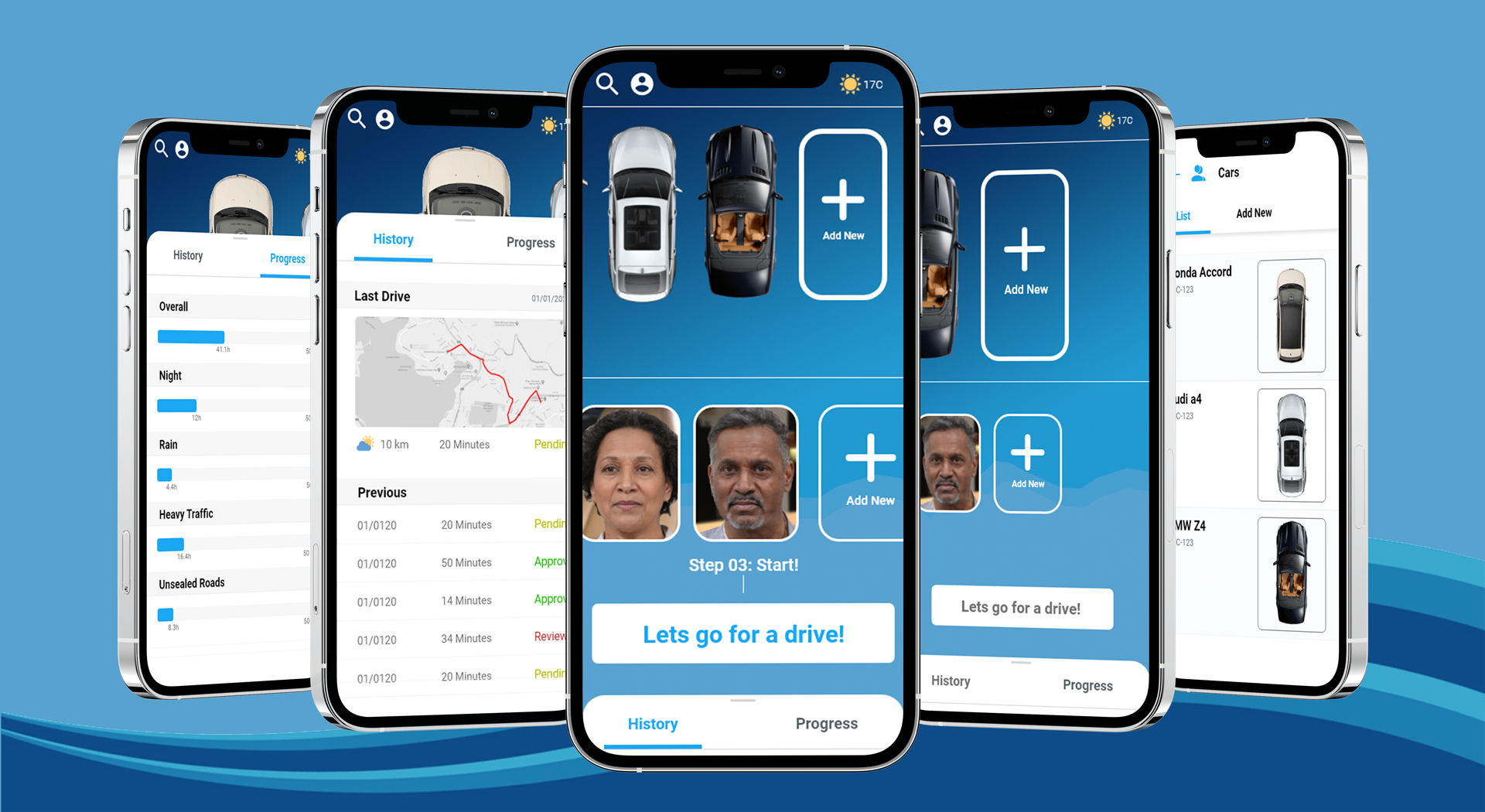
I set out to create an app that would be simple to use, focusing on a flat hierarchy, and visually appealing enough that people would want to use it.
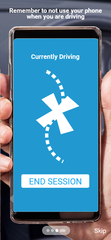
The goal was top start a driving session as quickly as possible. To help in this, I avoided a lot of text, opting for large visuals and touch gestures. This way, someone can glance at their screen, make a few swipes and be on their way. I also focused on auto-recording and auto-logging, reducing the amount of manual input.
The auto recording includes things such as start and finish locations, travel distance, length of time and weather conditions. After each trip, the user has the option to edit or add extra information if desired.
The target marked “just wanted to drive!” This became the focus for the project
A supervisor needs to sign off on each trip. Upon completion, all information is logged and set to “pending” awaiting approval for a registered supervisor. This extra step ensures accurate information.
Users found the multiple navigation types confusing. There were links to new screens while other links were in containers that slid into view.
There were also hierarchical issues on the main dashboard. The “lets drive'' button was not as prominent as it could have been and fought other elements on the page, making for a confusing mess and not ideal for someone talking a glance at the UI.
Integrating the “add cars” and “add supervisor” into the dashboard rather than its own menu icons cleaned up space for the rest of the elements. With this extra space, I was able to give the existing elements on more space, including increasing the size of the “lets drive'' button.
