I started researching the existing brand to get a sense of what they stand for. I also looked at similar organisations to gauge what context their new brand should follow
After researching the history and looking at the competitors, I focused on several key areas that represented the company. After some word ideation, I settled on these three:
These words best represented the brand and dictated the direction the brand was to grow.
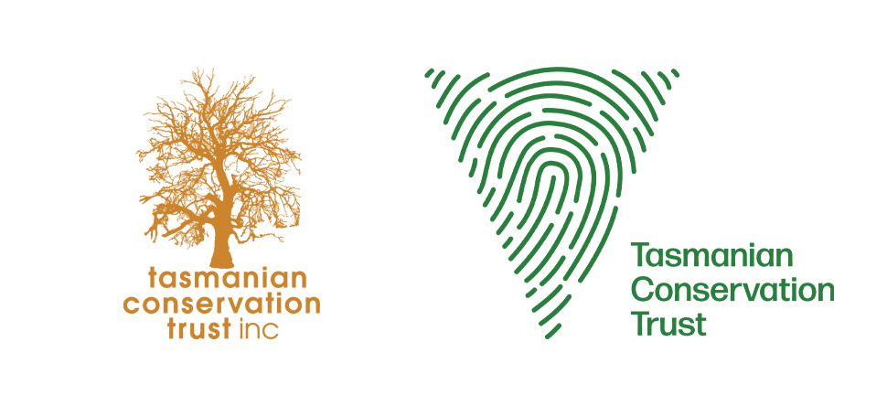
The old and the new logo
I began by sketching some images using the keywords as a starting point. Using the key term amplify, I started by sketching a series of radiating lines with some geometric shapes, representative of hands. I soon realised that it was too similar to the “Wi-Fi” symbol and tried different variations.
One sketch started to resemble a cross-section of a cut-down tree, giving a nod to the old logo. Experimenting with this concept, I saw similarities to a fingerprint, which would reference the community aspect. After more ideation, this idea warped into a triangle to represent Tasmania.
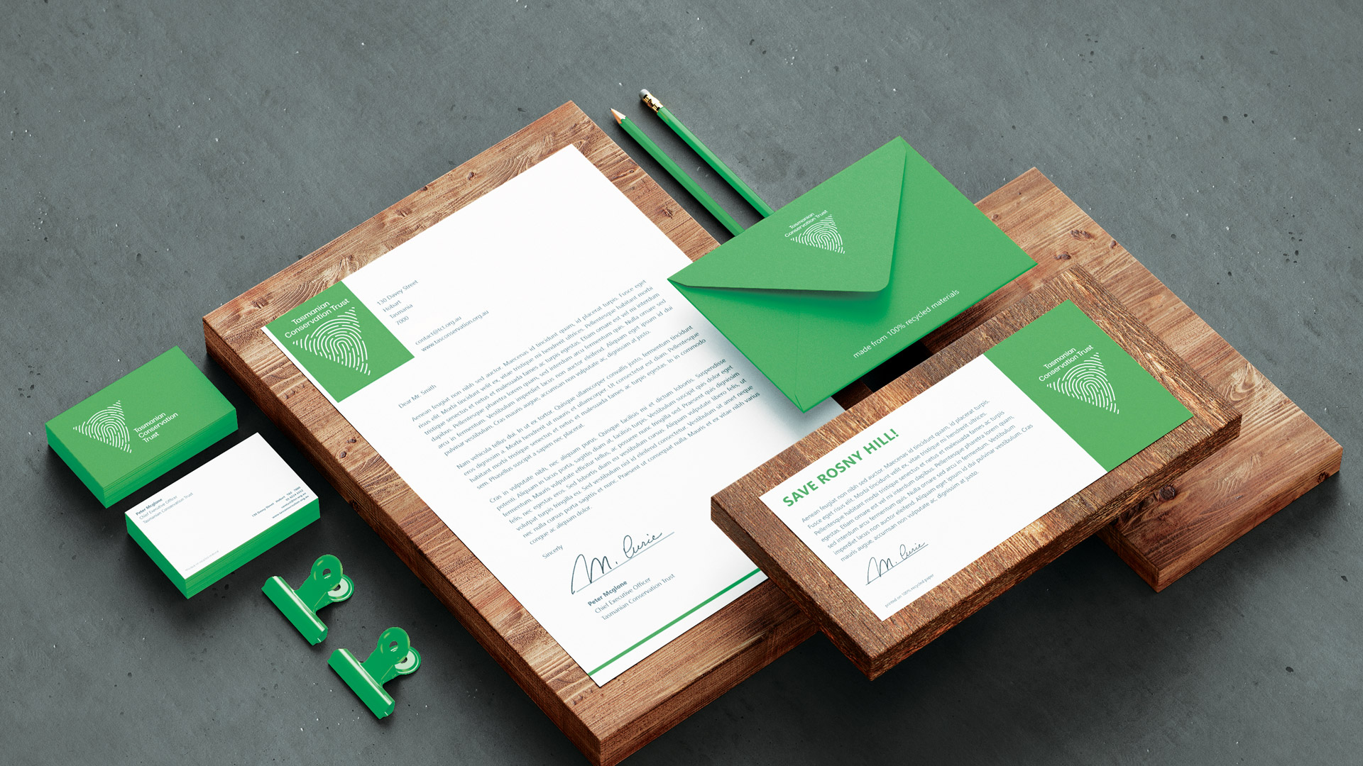
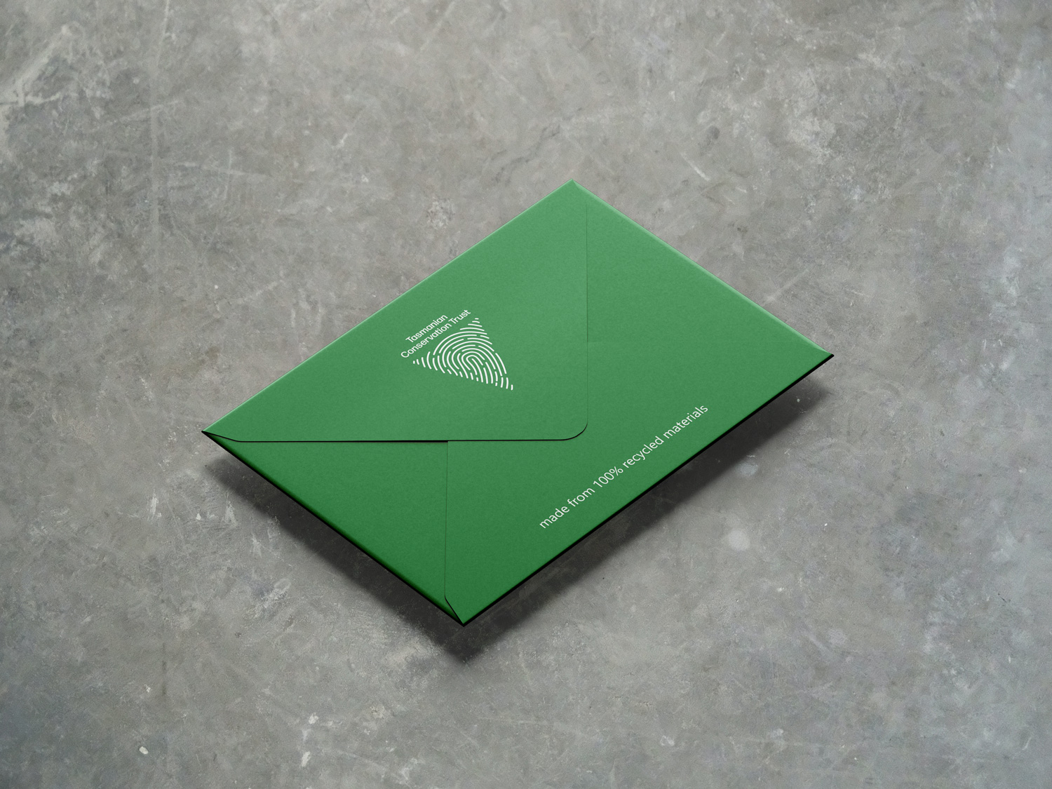
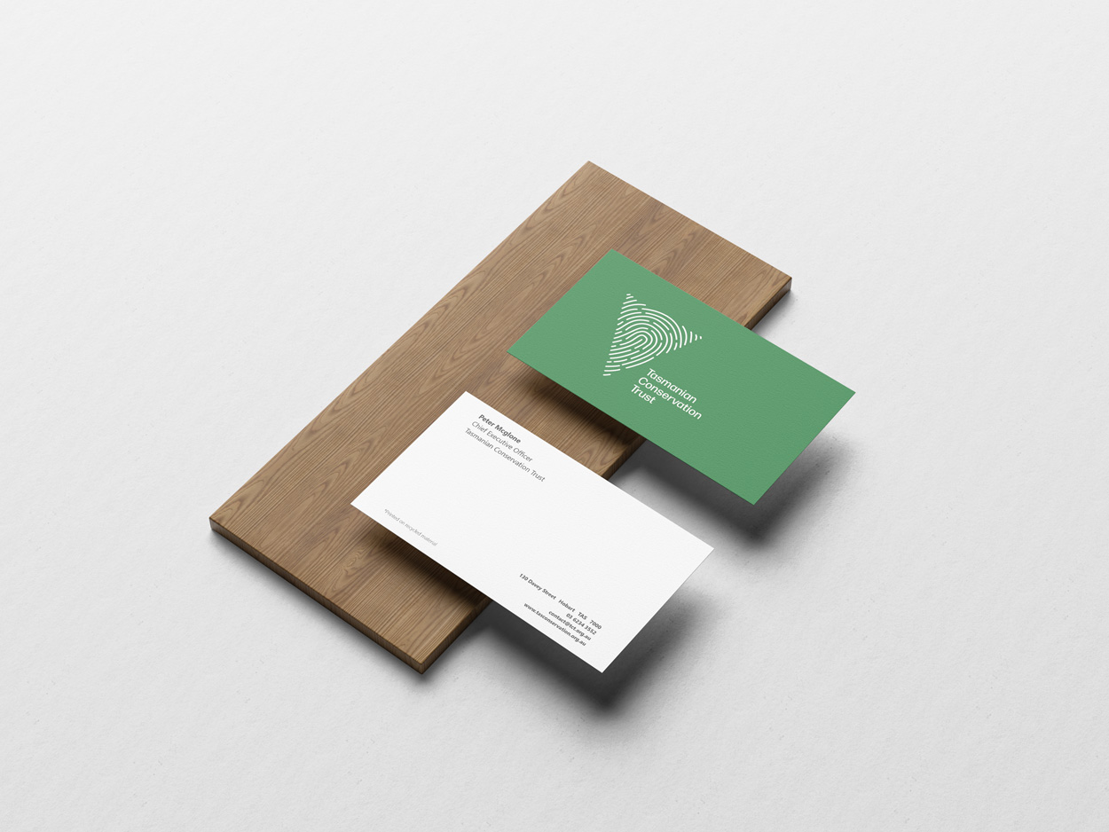
The colour was influenced by existing logos within the industry. I experimented with a two toned element but ultimately; I didn’t see a need for more than one colour, as it would unnecessarily complicate the design.
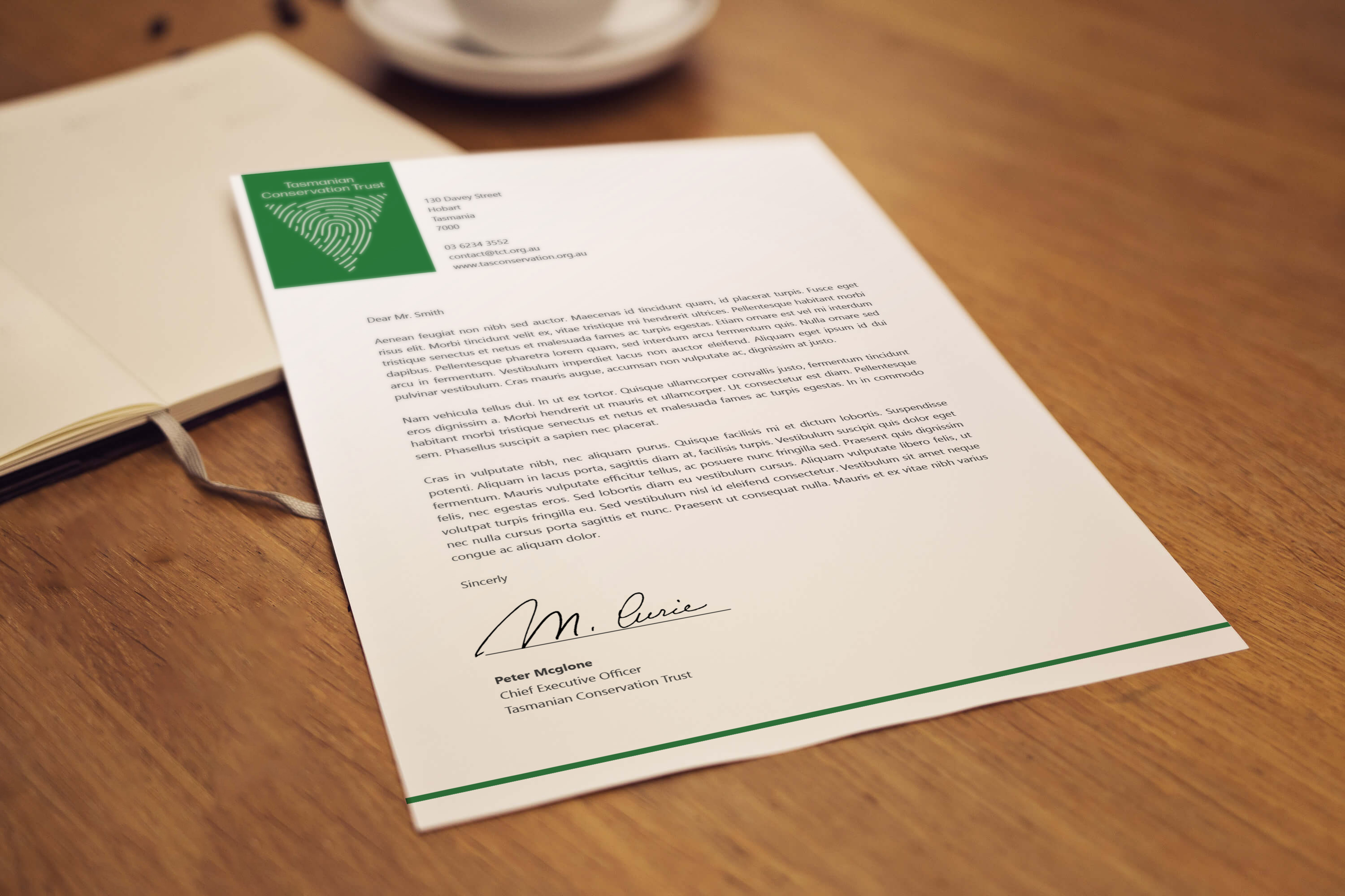
The typeface was chosen as it displayed a friendly personality by its slight curvature connecting the stem and bars which fit nicely in the brand’s style.
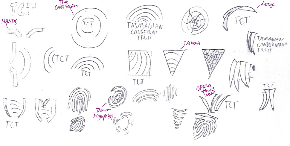
Ideation sketches
The colour was influenced by existing logos within the industry. I experimented with a two toned element but ultimately; I didn’t see a need for more than one colour, as it would unnecessarily complicate the design.
The typeface was chosen as it displayed a friendly personality by its slight curvature connecting the stem and bars which fit nicely in the brand’s style.